If I could I would… Change my kitchen design every year. Why because there is always a new design I absolutely love. Why not, well, because I’m not a lunatic. Out of these 11 designs, my 100% loves are the stunning kitchen by The Design Atelier , obsessed with the cut-outs and the drama of the darker blues and steel grey granite. My next favorite is the design by amber lewis design. The light cabinets and the mixture of different edges on the countertops are great. Lastly, the kitchen by DHD Architecture & Interior Design. I’m not sure I could survive the fingerprints on the antique glass mirrored cabinets, but this is a stunner for sure. Enjoy the view, I’m sure you’ll find a favorite.
DESIGN
11 Kitchen Trends 2023 Will See A Lot Of…And We’re Pretty Excited About Them
What can I say? We’re feeling good, hopeful even. It’s a new year, we’ve got an incredible January planned for you all and we are kicking off this first week of 2023 with one of our favorite posts…kitchen trends. This year, in particular, the trends just feel good, like there’s truly something for everyone. Or better yet, there might be something that opens up your mind to a style or feature you might have originally cast off as “not my style” if you’d only heard about it. Honestly, that’s my favorite part about trend posts and is really the point of them. We know that when most people hear the word “trend,” especially when it comes to an expensive room to renovate like a kitchen, there’s an almost involuntary repulsion. Why? Well, “trends” typically have a shelf life, right? But we know that when executed well, shelves can hold up for many many years:) And from last year’s predictions, metal cabinetry, double islands, frosted glass cabinet doors, and statement pot racks haven’t gone anywhere. So I hope you’re ready to get heavily inspired as well as be introduced to some incredible talent.
COLORFUL MONOCHROME KITCHENS

design by homme boys | photo by adam ports
How could I not start with the Homme Boys, Austin and Alex? Maybe it’s this happy yet not overly bright yellow kitchen that is infusing my brain with hope for a good 2023. I think if someone was to propose a saturated monochrome yellow kitchen, I would be hesitant to immediately get on board. But in the right hands (like with these designers) it’s somehow both energizing and soothing at the same time. That, I believe, is the direct result of going monochrome. Your eye is able to rest and gently bounce around to all the special details – the tile, the geometric shape of the hood and space above the cabinetry on the left, that picture window (and the view!). I asked them if they had any tips for someone who might also want to design a colorful monochrome kitchen and here’s what they said”
“We think the monochromatic look is done best when you fully immerse the room in the chosen color but change things up with a complimentary neutral and varying textures. For this kitchen, we complimented the bold yellow with a bright white and brought it through in cabinetry details, the countertop, plumbing fixtures, and hardware. On the reverse side of things, we chose the use of yellow in two ways- through the use of the color Dylan from Portola Paints saturating the cabinetry and geometric walls and the cadmium zellige from Zia Tile that has a color story all on its own.”

design by joy williams | photo by robert white
Next up is a kitchen the wonderful Joy Williams designed for the Southeastern Showhouse. Joy took this pretty blue and instead of using tile to get the monochromatic look like the Homme Boys did, she chose wallpaper. Not only is it a pretty option in and of itself, it’s a great affordable alternative if you love the statement of say, a bold marble but don’t quite have “a bold marble” budget. I also really love how she balanced the busyness of the wallpaper pattern with the lightly veined stone countertop and backsplash. This way your eye isn’t overwhelmed and is actually drawn upward.

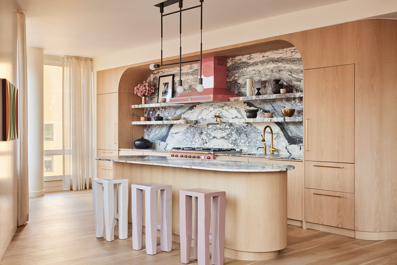
design by the design atelier | architecture by harrison design | build by the berndsen company | millwork by kingdom woodworks | styled by eleanor roper | photo by emily followill
For my last offering in this category, here is this stunning kitchen by The Design Atelier. What I love about this version is that it’s not entirely monochrome. The wood accents create just enough contrast to add depth but not steal the show. However, with that jaw-dropping blue stone slab, I’m not sure if anything could distract from it. I also love how this kitchen shows how even if you have a more traditional style, you can still get achieve this look. It’s playful yet wildly elegant.
THE NEW CABINET CUTOUTS
Sweet little cabinet cutouts are not a 2023 idea but they are having a moment and some people are going for a newish version…

design by emily henderson | photo by kaitlin green
Take Emily’s new beautiful farmhouse kitchen. She used cabinet cutouts to add that “farm/English” countryside vibe. But what’s extra special about her design is that without being overt, they are little H’s for Henderson. I love this almost secret personalization and stamp on this kitchen.

design by meta coleman | photo by chaunté vaughn
For a more classic take, designer Meta Coleman added them to all of the top upper cream cabinets. Not only do they add visual interest but they draw your eye up, helping you take the full space.
I also just love that tile and island color. This whole kitchen feels so welcoming.


left: design by colombe studio, photo by pion studio | right: design by charlotte harris lucas, styled by kendra surface, photo by laurey w. glenn, via southern living
But here’s where things get a little wild. Look at these incredible oversized versions by Colombe Studio and Charlotte Harris Lucas. Still a classic design but in such a fun, modern style! Cutouts never fail at adding sweetness to a kitchen in the best way. I think we’ll be seeing lots of new versions this year.
DARK METALS (WE’RE NOT TALKING MATTE BLACK)
We love brass and we love stainless steel but starting last year I was noticing more and more the use of dark bronze and blackened steel. I have to say I’ve been loving this new direction and now it’s really making a statement in kitchens.

design by kosa design | photo by read mckendree
I mean look at this kitchen designed by Kosa Design! Those metal cabinets are the perfect moody contrast to those natural warm wood cabinets and ridiculously pretty views. But notice how the metal has a ton of movement. It makes them feel connected in the space given everything else has a lot of movement (ie. the wood and the stone…and that view:)).
I asked the designer, Luke Ferran, if he had any tips if someone is considering metal cabinetry, and here’s what he said:
“It’s important to consider the weight of the metal and that’s why we opted to wrap wood doors in a lightweight steel. The steel was chemically etched and treated until we found the *just right* finish.”

design by a1000xbetter | photo by virtually here studios
But if you aren’t renovating but love the idea of adding a darker metal then take a page out of a1000xbetter‘s book and get something like a pendant! You could even just get some kitchen decor in a dark bronze or blackened steel for an even easier accent. Can we also just take a minute and look at how beautiful this kitchen is??
MIXED COUNTER EDGES
As someone whose never renovated a kitchen, there are some things that don’t think too much about. One of those things is countertop edges and if they should all be the same…

design by amber lewis design
But if Amber Lewis says, “hell no!” mix up those edges then I saw “hell, yes!” FYI she didn’t literally say that. I just get that vibe when looking at this photo of a recent kitchen she designed. I feel like choosing the same counter edges is a quiet “rule” that I’m happy to see is loudly being broken. Aren’t you? Think of the possibilities!
Now, I think there are a few reasons why this is a good option. 1. It is likely cost-effective. Say you love the look of an ogee edge but don’t have the budget to do your full kitchen – maybe then just do the island like Amber did. 2. It’s a great way to mix styles in a kitchen…again like Amber did. This is a fairly modern kitchen. So by adding a detailed edge to the island, it softens the design and brings in extra character.


design and photos by rachael wilshaw
Now, Rachael Wilshaw designed this beautiful kitchen with two special edges! I love how these more classically traditional stone edges contrast with the rectangular tile around the range. There are almost too many special elements in this kitchen to point all of them out. But please note the mix of stone and wood open shelves. So good:)
“HANDPAINTED” FLORALS OR NATURESCAPES
Let’s get decorative! Because people tend to be VERY careful in their decorative choices in their kitchens sometimes a beautiful choice, like a handpainted mural, is avoided. Hopefully, that ends this year.

design by colombe studio | photo by depasquale + maffini
I think this kitchen by Colombe Studio is pretty convincing. While every choice in this kitchen is a knockout (I see you tile floor), everything is in service of the gorgeous mural. I’m not sure if it’s actually handpainted or wallpaper but regardless it makes this kitchen. And if you ask me it feels pretty timeless.

design sophie dow donelson and celia bryson design | styled by darina bellini studio | photo by patrick biller
However, if you don’t have the space or budget for a big nature art moment, you can always add it in an unconventional way! In this kitchen by Sophie Dow Donelson and Celia Bryson Design, that Gracie wallpaper sample hung on the end of the cabinetry is such a fun addition that’s totally unexpected (in placement and material). You don’t always need a big piece to make an impactful statement.
LARGE SCALE TILES
While small-scale tiles really hit the design scene in a big way last year, this year is more “go big or go home” which I appreciate in design and in life. And look, small scale is not out, marble is also NOT out, but it’s time to make a little room for these large scale tiles:)

design by heidi caillier | photo by haris kenjar
Heidi Caillier can do no wrong in our book! When you look at this kitchen, there are so many special things happening – the lighting, that moody navy color, the stone, those stools! But what helps ground the whole space are those large sale stone tiles. Given that there are so many wonderful lines in the cabinetry and beadboard backsplash, having fewer lines in the flooring (with either smaller-scale tiles or skinny wood planks) helps to balance and ground the whole space.


design by hamran | photos by inger marie grini
This next kitchen by Hamran is a knockout. What a gorgeous modern, minimalist kitchen that’s only enhanced by those large-scale tiles on the backsplash. This kitchen and the one before prove that this “trend” works for any style. Also how great and unexpected are those blue pegs!

design by ysg studio | photo by prue ruscoe
Large-scale tiles aren’t just for floors and walls…they work for counters and islands too. To be fair this blue stone used by YSG Studio is INSANELY cool because of the color (duh) but also the wonderful movement. I think that’s the key to why it works so well. You almost have to double-take to make sure that it’s not a single slab. Oh, and see how great the large-scale tile contrasts with the small-scale wall tile (in size, color, and texture). Just perfect.
PILL-SHAPED ISLANDS
Now let’s talk about THE kitchen island of 2023 – The Pill-Shaped Island. It’s modern in nature but can easily work in a more traditional kitchen with the right materials, of course. I think it’s just a pretty option, especially when you want to break up the shapes in your kitchen design.
design by le whit | photo by nicole franzen
This kitchen by Le Whit is extremely special and that island is a big part of that fact. While there are a few other curves within the design, the rounded ends of the island help to really give a nice flow to the space. And how cool are those ombre stools?

design by jean stoffer design | photo by john stoffer
Even the son and daughter-in-law of famed designer Jean Stoffer, John and Maura, decided a pill-shaped island in their serene and chic kitchen was perfect for them. Here’s what John said when I asked why they went with the pill shape:
“We went for the rounded island to help with the flow of the room. We moved our kitchen into a small room that used to be a formal dining room. In order to have the island length we wanted, rounded off the edges helped with flow around the space. And for obvious aesthetic reasons :)”
The choice clearly paid off!
ANTIQUED MIRRORED ACCENTS
Are you surprised?? I clocked this trend a few months ago and now am wholeheartedly convinced that antiqued mirrors will but huge in 2023. Given that “antiqued” is literally in the name, this is another “trend” that’s not new and when done well, can stand the test of time.

design by dhd architecture & interior design | photo by david mitchell
Are you in love because I am? This kitchen by DHD Architecture & Interior Design from their Flatiron Triplex Penthouse project is pretty special. I think the use of the mirrors in the uppers is so beautiful and undoubtedly makes this space feel bigger but also textured. Please note the dark bronze hood;)

design by alessia zanchi loffredo | photo by ryan mcdonald
This use of antiqued mirrors is much more of a statement and wonderfully contrasts the more traditional design of the cabinetry. Now I know that when you hear “antiqued mirrors” you think traditional right? But here they look wonderfully modern in how designer Alessia Zanchi Loffredo decided to install them. These mirrors give you options people!
THE NEW NEUTRAL
This might be the biggest trend of 2023. Why? Well because if you are renovating it’s the most accessible since it’s really just a paint color. Yep, the new neutral says goodbye to a bright white or a cool light beige – this is more of an earthy, soft yellow/green. WAIT! Stay with me. Once you see these photos I think you’ll be convinced (even if it’s not what you would pick for your own kitchen).
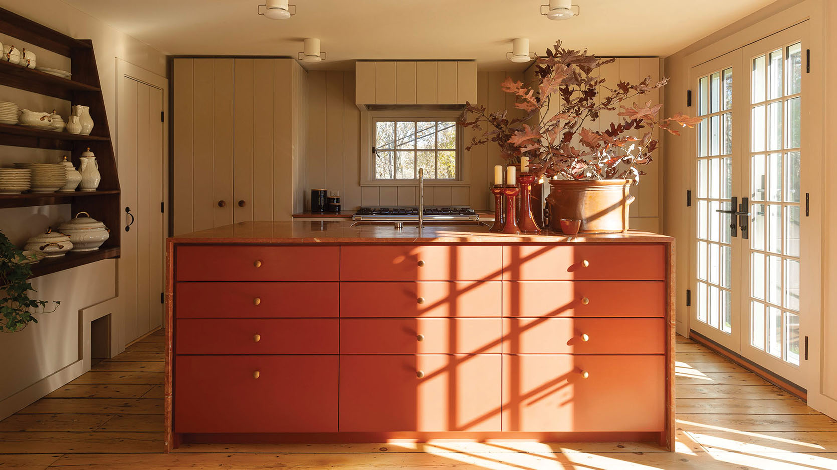
design by workstead | photo by matthew williams
Workstead is an EHD favorite lighting brand and design firm and I think you can see why. Their design walks the line between modern and classic, yet so so inviting and unpretentious. This kitchen is the perfect example of that with its warm taupe-y cabinet color. It’s neutral, a little moody, but still easy to work with a variety of other colors…like an orangey rust-colored island.
I also would like to call the pink and red stone trend now. It’s not on this list but it is on my other “watch list” 🙂

design and photo by devol kitchens
Maybe another way of looking at this is a “muted” neutral. deVOL kitchens know how to use color and this cabinet color (that to be fair leans more yellow) still falls in this category. It’s not taupe but it’s also not a true yellow.

design and photo by devol kitchens
It’s just a beautiful muted neutral that still feels happy to look at. But then again this whole kitchen makes me feel happy to look at.

design by sarah sherman samuel | photo by nicole franzen
Have you seen Sarah Sherman Samuel’s new show, Inspired Interiors?? Well, that’s where I saw this great kitchen she designed for one of her employee’s new homes. They wanted a California vibe in their new Michigan home and that’s exactly what they got.

design by sarah sherman samuel | photo by nicole franzen
This cabinet color has much more brown in it but still has the yellow/green undertone that this “new neutral” is all about. If you are looking for an earthy color this could be perfect.

design by studio bka architects | photo by jacqueline marque
Let’s go even darker and saturated. Now, this cabinet color is still in the same family but far more green and is so pretty. It feels modern but really grounded. The whole mix of a modern subway tile, a vintage-inspired range, and modern traditional cabinetry is so beautifully balanced. Studio BKA Architects nailed it.
So as you can see there’s a range in tones with this color trend but they all give the same vibe and feeling. Would you paint your cabinets one of these colors?
TWO-TONED COLORFUL CABINETS
For my neutral-averse friends, fear not. This next one is all about color! And more than one…in the same room. We all love a white and black, white and wood, white and navy two-toned cabinet combo. But this year is all about taking a chance on color. Wanna see?

design by charlie ferrer | photo by jared kuzia
Can you believe how beautiful this kitchen is by Charlie Ferrer?? And by two-toned I really mean multi-toned. I love that they chose to go for a soft blue for the uppers and they go really saturated for the bottom cabinetry. Then to really up the happy dial, a mustard yellow island. I think because the top half of the room is visually very calm that this doesn’t feel overwhelming. It’s just awesome. I also will never not love a diamond-patterned floor (especially painted on top of wood).

design sophie dow donelson and celia bryson design | styled by darina bellini studio | photo by patrick biller
Surprise! A double-trend kitchen by the talented Sophie Dow Donelson and Celia Bryson Design. First the “handpainted” naturescape detail and now the two-toned colorful kitchen. This one could actually almost work for the colorful monochrome trend too with all the purples. However, despite falling into these trend categories, I don’t look at this kitchen and think “this is a trendy kitchen.” Instead, I think this is a joyful, colorful kitchen with both wonderful traditional and modern elements. Also, look at the eggplant color and blue color. They both live in the same tonal world which is why they work so well together.
WHIMSICAL/DESIGN YOUR KITCHEN FOR JUST YOU
Ok, this trend may actually be my favorite because this trend is all about creating the exact kitchen you want, not worrying about what a future buyer might want or dislike. Life is short so why not have the kitchen of YOUR dreams right??


left: before | right: after and design by bri emery and spaulding company
Bri Emery‘s INCREDIBLE new kitchen in her Upstate New York home is a breath of fresh air. There’s a chance if she would have described her design plan that you might be worried about resale value, right? But look how it turned out! It’s so special, full of joy, and in her sweet A-Frame I think this kitchen is an incredible one-of-a-kind gift to anyone who might own this home should Bri and her husband sell. But for now, they just get to enjoy it fully.

design by hannah polskin | photo by emily sudlow
For this next kitchen, artist Hannah Polskin wanted to put her beautiful mark on her minimalist kitchen. Naturally, she decided to customize her kitchen island. With her unique design, this kitchen now has so much movement and joy. I love how free it feels and also what a statement it makes! Step aside marble island:)

design by catherine earp
Lastly, we have this boldly sweet and colorful kitchen designed by Catherine Earp. It is one of two luxury huts called Aller Dorset, located in the Dorset countryside of England. So while this isn’t anyone’s full-time kitchen, it is a great source of inspiration, showing that bold colors, patterns, and sweet details are worth going for if that’s what you are drawn to. How could you not smile every time you walked into a kitchen that looked like this? Impossible.
Ok, the 2023 kitchen trends have been called! We promise to keep you updated as the year progresses:) So what do you think? Any favorites?
Love you, mean it.
Opening Image Credits: Design by Workstead | Photo by Matthew Williams
Article by BY JESS BUNGE | 1.4.23